This was a rather quick edit that I was asked to make just a few days before the convention. I was asked to just put together a photo of each of the guests, however I wanted to make it thematically similar to the branding of Belfast Film and Comic Con itself. So, I added a gradient on the background, fading from blue to black and gave a yellow/orange one to the typography. The red for the 2017 helps it stand out, contrasting the background, yet complimenting the other typography.
Monday, 13 March 2017
Friday, 3 March 2017
Cosplay Business Cards!
Yay for more self-promotion! I managed to mix my graphic design skills with my hobby of cosplaying! I created the brand 'Agent Delta Cosplay' for myself a few years ago. It's a simplistic name and I stuck to the green on black design I used for my personal branding (and also for this very blog!)
I wanted a sort of 'cobbled together' look for these. So I purposely added textures and weathering to both the front and back of the designs. On the back, I did a 'top secret file' shape, then used .png files of sticky tape and a paperclip to affix a few photos of some of my costumes to the file. This gives an overall 'document' look to the cards and is exactly the character I wanted to give this branding. I then provided my two social media links for anyone who wants to follow me on them, again using simple green text and logos against the yellow folder background. I think I would like to redesign these at some stage, perhaps adding more photos on the back and maybe stylizing the front a little bit differently, but we shall see!
The main reason I made these was because I have been invited to be a cosplay guest at an upcoming convention! I will have a table, where I will be signing photos, giving out these cards and will also have some of my props with me. I will also be giving some talks and helping entertain attendees at
Belfast Film and Comic Con 2017
Titanic Exhibition Centre
I'm really excited for this opportunity!
Friday, 3 February 2017
WISH Banners
These were two relatively quick banners that I made for a friend. She does a lot of charity work as Merida from Brave and various other popular characters. She has arranged a cosplay themed ball and asked me to design two banners; one for online, one for projection, to be used to promote the event. I was provided with their existing logo, images of the characters who were to be present at the event and also some contact details for anyone wanting more information.
Nothing too drastic or challenging (even though I was getting ready for work when I was drafting the first versions!) but hey: it's kept me creatively active and also guaranteed me a free ticket to the event!
Sunday, 9 October 2016
Queen's Radio Poster Designs
Yay for proper design work! Once again, my hobbies allowed me to connect with my graphic design skills! A friend I met through cosplay commissioned me to design some posters for Queen's Radio.
The main one was for a night in September, where people could request songs. Because of this, the night was called 'Queens Jukebox.' The QR Group requested that I include an old jukebox, as well as some 'soundwaves' coming from it to represesnt the music. I also decided I wanted to go for a retro, faded textured style. I added folds, old textures and went for some retro inspired fonts.
The top image is the poster/flyer which was mass printed and used heavily to promote the event. The second is the reworked, landscape format for the facebook page. It was quite surreal seeing my own work all over Queen's University!
I was also asked to design a simple recruitment poster for the Queen's Fresher Day. The design was to be kept basic, communicating the relevant contact information. I decided to keep it thematically similar by adding creased paper textures, as well as nautical stars, at the client's request.
Overall, I am happy with how these turned out and it was fun getting paid design work, which was featured so heavily across both social media, as well as on the Queen's campus itself!
Sunday, 4 September 2016
My Return!
HELLO! Yes I am still here! I know it has been a while since I posted anything on here, so this is just a quick post to help update on some things.
Due to a bereavement, my time has been mainly spent with my family. Added to that that I have also been working almost full time, as well as an extra set of tasks that that was earning me some extra money. I have been flat out!
HOWEVER!
I have not been entirely idle! I'm currently working on a few branding projects for friends, a few poster designs for some clients and have also joined a new website which issues some design challenges! So yes: stuff will be coming soon!
Due to a bereavement, my time has been mainly spent with my family. Added to that that I have also been working almost full time, as well as an extra set of tasks that that was earning me some extra money. I have been flat out!
HOWEVER!
I have not been entirely idle! I'm currently working on a few branding projects for friends, a few poster designs for some clients and have also joined a new website which issues some design challenges! So yes: stuff will be coming soon!
Tuesday, 26 April 2016
Club Cosplay Posters
I'm finally able to merge my cosplay hobby with my design work! OK, so, I was asked by some friends of mine to help arrange a cosplay night out. The University of Ulster is running its first ever convention this weekend and we decided to run an after party. What was really amazing was that the guys running the convention gave us their blessing and we were allowed to advertise it on their social media platforms! The goal was to make a series of posters/flyers/facebook banners that would appeal to the sci-fi/fantasy audience that the event would appeal to. I therefore chose to find images of some pop culture characters as musicians and add them to the poster series. Overall, I was very happy with the end results and how well they were received by my friends and the others that I am helping plan the event with!
Sunday, 27 March 2016
Actual Design Work!
Yes, I know. ANOTHER long absence! But good news, everyone! I'm actually getting some design work sent my way! This was the first one. My brother plays Aussie Rules, for the team The Belfast Redbacks. He asked me to design a flyer that they could use on social media. I kept it as simple, yet professional as possible. I used the colours from the team's logo, then factored in a gradient, used some images of the team and included the contact information. I'm so happy to be able to actually flex my design skills for something functional!
Sunday, 24 January 2016
My Return!
Yes hello! I apologize for my long absence! I was very very busy from October right through to December of 2015! Anyway, I will get the negative part out of the way first: I no longer work at the dress designing company. I was told that I had been successful and was even asked to quit my current part time retail job. I made every effort to get up to this company and had said that I would keep my other job on weekends. It's actually very lucky that I did this, as I was unceremoniously told that I wasn't being kept on. It turns out that I was very misinformed. Oh well: experience is experience!
Now back to the normal stuff! Below are some of my 'Convention Posters' that I worked on in 2015. I treat each convention like a movie, so I tend to base the designs on either existing ones, or making them inspired by a certain genre or theme.
Q-Con XXII Croft Teaser Poster. This was made like a 'critics' quotes' poster, to tease my (then unrevealed) costume of Tomb Raider. I purposely made all of the quotes negative, as the costume is supposed to be funny and creepy. The Joel Schumacher quote is an in-joke into his much reviled costumes in Batman and Robin.
Q-Con XXII Final Lineup Poster. This is very obviously inspired by 'The Good, The Bad and the Ugly' and was quite quick and easy to make. I simply cropped an existing photograph of each of my three costumes and put them into the three, weathered, western inspired sections. 'The guy with the gun' is a reference to a classic quote from Army of Darkness, the third Evil Dead movie.
Belfast Film and Comic Con Minimalist Poster. This has no particular inspiration, but is rather simplistic and flat, relying on the two signature props of my two signature cosplays to hint at my chosen costumes for the Halloween Con. The rainbow slinky for Ace, the new chainsaw for Ash. I decided on 'feature length' as a tagline, as it hints towards a feature length movie, whilst also being a euphemism for the dirty minded among you!
80s Inspired 2016 Teaser Poster. This one is heavily inspired by 1980s movie design, with lots of neon colours, gridlines and gradient effects. This isn't inspired by anything in particular, but I looked at old video game artwork, the film 'Drive' and the designs for the game 'Farcry Blood Dragon' to help get inspiration for my colours and design aesthetic. The title of 'Electric Boogaloo' is a trope referring to an unnecessary or unwanted sequel. This is my second year cosplaying full time, so I'm referring to 2016 as a 'sequel year.'
Lineup History Teaser Poster. This is mentioning four cosplays that I did each year since starting cosplaying. Some creative choices were made, as I wanted to include The Scout (he has no last name!) Dipper Pines was the year before (but he was the only one I did!) and The Punisher has never been worn to a con (But Castle needs to be included to make the numbers!) The inspiration of using surnames is in reference to The Expendables, where the poster mentioned all the famous actors in the film. I wanted to censor the four new costumes I'm planning for 2016, so went for a crumpled paper, coffee stained and pen marked aesthetic. This was the fastest I've ever made a poster from idea, experimenting and finalizing and I'm happy with it, as it gets the idea across very well!
Sunday, 4 October 2015
Update...and dress designs!
For the past two weeks, I have been working part time in an Irish dancing dress making company! These are my first two practice designs, which I sent to the owner of the company. He liked them and I was took on board into a four person design team! Together and on our own, we worked on our own designs, working from both real and made up briefs, designing dresses for customers. It is providing some great insight into the design industry, as well as the clothing design industry. This helps, as it ties into my own interests in cosplay and prop making, as well as graphic design!
Tuesday, 1 September 2015
Love Photography NI Branding
I apologize for taking so long to upload this one! OK, so, during the summer, I found my first real client! The company was called 'Love Photography NI' and was looking for a simplistic, recognizable brand identity. I was told that the three colours which the client wanted were; red, black and white, with a heart incorporated somehow. The first two images below show my initial experimentation, where I kept the three colours and heart emblem, playing around with different styles and textures. I was attempting to create a modern, but not oversimplified design.
I sent these to the client, but she seemed to dislike all of them, so I tightened the idea to making the heart resemble a camera lens, thereby making the brand encompassing both the name and the type of company it was. My designs became more focused on this concept, which helped inform the stylistic choices. I decided to keep an all caps, sans-serif font for the main word 'love' and opted for a cursive, more freehand styled font for the 'photography NI' part of the brand. I was quite happy with how these turned out and thought that the idea could be worked into an effective brand. However, the client still did not like my idea.
The client sent me a mockup design and told me to keep it as close to this as possible. I continued experimenting with the brand, altering the layout and even tried adding an emblem of a camera. The client seemed more responsive to these ideas and liked the second set of experiments.
However, I was told to keep it as close to the mockup as possible and therefore tried removing the letter 'O', trying to let the heart emblem act on its own, which I would say is more effective looking. Once again, the client asked me to copy the concept and to put the letter 'O' back in.
Shown here is the final logo, which was done in black on white and white on black. I also cropped out just the letter 'O' with the heart inside it, which the client wanted to have as a watermark to add to photos. I was also asked to add a small 'TM' to the side of the brand.
This was my first real client and my first real branding project. Whilst I had a lot of fun experimenting with layout, fonts and negative space, I personally am unhappy with the final result. Throughout the branding process, I consulted some of my peers, did plenty of online research and also asked for some advice from professionals. I made sure to make use of what I had learnt about branding during my time at university and was sure that some of my experimentation would have been welcomed by the client. Unfortunately it was not and the final logo is identical to the initial mockup. It was a learning experience, however. It is yet another piece for my portfolio and I can say that I have worked in branding for a live client. I was also advised that, from now on, I should explain what a graphic designer does to any future clients and explain that it would be in their best interests to take some of my advice and experience onboard. Live and learn!
Wednesday, 19 August 2015
Q-Con XXII Poster
OK, OK, last Q-Con related post for now, I promise! I've been crazy busy lately and so am only getting around to uploading these all at once! Anyway, as you all know, I like to create a poster for every con that I attend, to help commemorate it in some way. For this latest one, I settled on a very minimalist style. I chose to represent my three cosplays in their most basic way, with only the respective tops and bottoms being shown in a flat, vector style. I also decided against showing any props, to help the piece not look overcrowded.
Initially, I attempted to put them on a clothes line, showing the costumes in a more 'natural environment' but it just looked stiff and awkward, so I went for a straight up and down layout instead. The Croft costume emphasises how short the shorts were, the Ventura one shows how oversized his shirt is and the Williams one shows the intentional damage to the shirt! Therefore, the three iconic parts of the actual costumes is displayed in a concise, visually appealing manner.
World of Warcraft cards
Long time no update! OK, so these were technically my first commission! Two friends of mine were also attending Q-Con in World of Warcraft Alliance costumes that they had made themselves. To add to this, they asked me to design some business cards to act as a 'Call to Arms' to join them.
I know barely anything about the game, so I had to rely on my friends for guidance. Essentially, all they needed was the Alliance lion emblem, with a passage from the game's lore below it. Because I was very pushed for time before Q-Con, with work (and working on my Ace Ventura performance!) I was actually nervous that I wouldn't complete this in time, but welcomed the challenge. I got a few reference images of the Alliance emblem and found that they usually have a metallic texture. I decided to emulate this, but also keep within my usual flat, graphic style. So I played around with a few gradients and shading techniques, but still keeping it simplistic looking. As for the font, I wanted to keep it all caps and sans serif, so I chose Futura. This kept it legible and also kept it within the style that I was going for. Then I added a few lines to help frame the message and added a subtle gradient to the background to finish it off.
Overall, I was proud that I was able to finish this in such a short time span and get them sent to Nathan in time for printing for the con! Above, I've shown a few photos of the cards beside my friend's Warcraft hammer prop for scale and to show the theme.
Sunday, 28 June 2015
Q-Con XXII Aftermath!
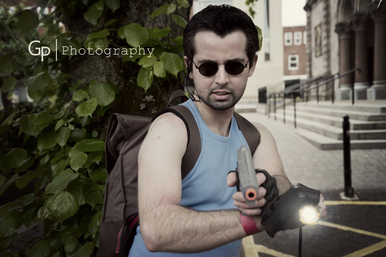
OK, so here are three of the official photographs of all three of my cosplays over the Q-Con XXII weekend! I had an absolutely brilliant time and met some amazing new people! I had originally spoken to some people online and this was my first time meeting a lot of them. Chris Reaney: the entire Spider-Verse in one man stands out! He was Spider-Patriot and Spider-Punk, with both costumes being too awesome for words! Others knew me as 'the chainsaw guy' or 'the Ace Ventura guy' or 'that agent guy from instagram.' These are all titles I am ok with.
I was able to actually make it to the comedy club, pub quiz and closing ceremony this year, all of which I usually miss out on. I had such an amazing time and could write a novel on my experiences, but want to keep this post brief. The cosplay community is so open to discussing costumes and I am so glad I took the leap two years ago and started this hobby. If anyone reading this is thinking about trying cosplaying for the first time, I urge you to do it! Anyway: onto my costumes shown above:
On Friday, I compiled a male version of Lara Croft I called 'Leon Croft' and he was very well received! I got a lot of great shots hanging out with other game characters like my new twin Amy Donaghey who makes a kickass Jill Valentine/Claire Redfield/Poison Ivy!
On Saturday, I brought out my Ace Ventura, this time with a wig! I was able to tame the new Q-Con cat 'Khal', who later turned out to be lost, but the owner was able to find him after she was all the Q-Con photos of him with cosplayers! I also performed a skit on stage as Ace Ventura. I was so nervous, but the audience seemed to like it!
Sunday was the return of my signature Ash Williams cosplay! I also wore an 'Ash Ketchum' hat from Pokemon, both to hide my hair and to make me a walking pun. My chainsaw prop is starting to suffer from all these events and weather! However, I am openly discussing and working on a possible fourth version!
Currently, I am planning to go to Dublin Comic Con in August, then Showmasters in October! I am so thrilled that cosplay is taking off over here, finally! Q-Con had such a broad range of cosplays and I am already looking forward to next year!
Massive shout outs to Roll VT Productions for all the interviews (and for holding our group together!) and to GP Photography, who everyone NEEDS to follow on facebook: his photographs are out of this world!
Saturday, 13 June 2015
Challenger Approaching!
This is the second teaser image, again based on Super Smash Bros game. It was relatively simple: just darkened a photo of my secret cosplay, cut around it and added it to the template, with another copy of it to give the 'shadow' effect. At the time of writing, there is under a week remaining before the big reveal! Be at Q-Con to see it in person!
Saturday, 6 June 2015
Ominous Q-Con Teaser
*VOOP...VOOP...VOOP...VOOP...VOOP...VOOP...VOOP...VOOP...VOOP...VOOP...VOOP*
Q-Con.
Queen's Student's Union.
Friday 19th June.
A scary sight to behold.
Do not miss this.
Sunday, 31 May 2015
Beneath The Masks Website
Roll VT Productions
The website for the cosplay documentary is up! Please go have a quick look, it will be updated throughout 2015, as we work on more filming and several other secret parts we are planning!
Friday, 29 May 2015
Project: Tekken - Ancient Ogre
Sunday, 24 May 2015
I Have No Mouth and I Must Scream
I read the classic short story by Harlan Ellison: 'I Have No Mouth and I Must Scream.' The story is about a post-apocalyptic world in which a super computer called 'AM' keeps a small group of humans alive and constantly tortures them. I made a collage in my sketchbook featuring Ellison himself, with the title spelt out in mismatched, uneven letters which I cut from newspapers. These were placed over Ellison's mouth and a background photo of several people in gas masks.
The page on the right is a simple typographic piece of AM's famous speech about how much he hates humans. The font I used was the standard 'agency' style, which fits with the retro-futuristic style of computer that AM is. I then decided to alter this page in Photoshop, adding various stained and crumpled textures, to give a real sense of damage and weathering, much like the world featured in the story.
Game of Thrones Dragon Eggs
These were made back in November, December, January time for a fellow cosplayer's birthday! I'll not embarrass her here by saying her name, but she's the biggest Game of Thrones fan that I know! I have been editing the photos on and off since then, but have finally narrowed it down to 10 that really show off all the necessary details. The large basket was a hamper one that I bought online. I then wrapped some twine around it to add to the outer decoration and threaded some ribbon through the slats to hold it all in place. The Targaryen House Emblem was traced, then cut out and also stuck down across a ribbon weaved design on top of the basket. The eggs themselves are simply polystyrene ones, with every scale cut out individually and held in place as the PVA glue dried in. The sheet inside is simply a table cloth bent and creased to hold the eggs in place. Just to finish it all, I typed up
Daenerys Targaryen's full title from the series, but with my friend's name instead. This is only the third prop I have ever made and I am really happy with how it turned out! The silver egg is still pretty rubbish to me, but it was very well received by who it was made for!
Subscribe to:
Posts (Atom)


