

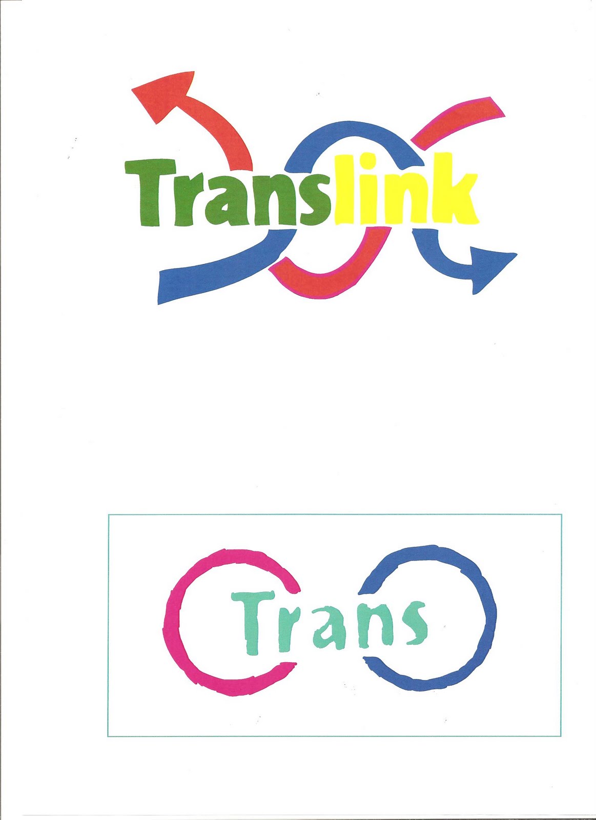
We were asked to create a new logo for Translink. After about 8 a4 pages of sketching ideas, I settled on a simplistic (although admittedly generic) logo. I simply used the existing Translink writing, then overlapped two twisting arrows around the writing. I used the two colours that correspond with the bus colours( a pinkish colour and a dark blue colour). I left the logo as solid blocks of colour, with no outlines, thereby giving a 'softer' feel. I another idea for an alternate logo, playing off the word 'link' in 'Translink,' I decided to design a logo resembling the 'links' in a chain. Many of my original concepts were overly complicated looking, distracting from the link idea, so I chose to simplify it. The two 'rings' are again using the same colours of the bus routes, but are linked with the word 'Trans.' Thereby the logo literally meaning a 'Trans-link.' I made the logo look scrbbled, with the black outlines left in, and experimented with them being taken away. After I designed these logos, I experimented with different colours.
No comments:
Post a Comment