Once again, just another random idea that, once I get it in my head, I have to see it through. Simply combining one of my favourite new animated series, Regular Show and one of my favourite bands, Daft Punk. Taking inspiration from their latest album cover Random Access Memories, I portrayed the two main characters. I considered having the band name 'Mordecai and the Rigbys' but opted for the title of Regular Show instead..

Friday, 9 August 2013
Thursday, 8 August 2013
Miss Hepburn

Today I felt like drawing Audrey Hepburn. You may ask me "Why?" I reply emphatically with a straight: "Why not?"
Monday, 5 August 2013
Ash. Get It?

Sometimes, I get a simple, silly idea and have to see it through. This was one of them. Having only recently watched the original Evil Dead Trilogy and being a long time fan of Pokemon, the two 'Men Called Ash' merged in my odd mind and an illustration idea was born!
Wednesday, 31 July 2013
Behold: Ponies!


Just a few of the random ideas I came up with after attending Q-Con last month. Yes, I am a brony and decided to showcase it with some fanart. Nothing too mind-blowing, but the KISS idea was one that just sparked from my quite bizarre idea process. Hope you enjoy!
Friday, 26 July 2013
Sergei Dragunov

"..." - Sergei Dragunov on this illustration.
So this one was inspired by Soviet propaganda, with bold uses of red and yellow. I chose to keep Dragunov as solid shapes of colour with no shading to match that art style. I also experimented with adding a folded paper texture to the background to make it appear to be an old piece of paper.
Monday, 17 June 2013
Kunimitsu

Wednesday, 22 May 2013
Angel

The ball is rolling! I decided to represent the beautiful Angel in a stained glass window style. The texture was done on a white layer and placed over the top. This resulted in the image appearing a bit faded and flat, both of which added to the aged style I was aiming for. Overall I am pleased with how she turned out.
Monday, 6 May 2013
Prototype Jack

Finally part two! This took longer, mainly due to procrastination! I wanted the style to reflect a design, given that the character is a 'Prototype' for the Jack series of robots. I wanted parts of him to be drawn in wire frame, to suggest that he is still being developed. I finally finished the piece and am proud at how the shading and styling turned out.
Friday, 8 March 2013
Tiger Jackson

I humbly present the first of many. This is going to be a series of illustrations based on every Tekken Tag 2 character, each presented in a way which fits their character. I chose Tiger Jackson as he was my first idea. The aim was to create a simple illustration, using flat colours and old style writing to hark back to 1970s disco album covers. This took significantly longer than I had hoped, but overall I am pleased with it as a first part of a series. COMING NEXT: 'Codename blueprint'

Wednesday, 15 August 2012
Experimental Avengers Artwork


Thursday, 5 July 2012
Business Cards

They finally arrived yesterday! 200 copies of my finalised, redesigned business cards from Moo.com. The original cards were one-sided, simply had my initials on them and were rectangular. These final products are printed onto a thicker, matt card, with rounded corners, a detailed border and a better use of space.From here on out, I am going to always carry five of these with me and will also be looking for places to leave them...
Tuesday, 26 June 2012
UPDATE
Having some trouble uploading images lately. Not sure if this is a blogger issue or just my laptop, but rest assured I have been trying! I have some images from the end of year show where my work was exhibited a few weeks ago, but uploader is not my friend right now. As soon as it is working, the images will be up!
Monday, 21 May 2012


Sunday, 20 May 2012
Personal Development Plan Review
Here, I am going to reflect on the past sixteen weeks and provide a general overview of my experiences. Overall, I found this semester to be just as challenging as the last one. I think it was different, in that we were largely left to our own briefs and time management, which is great to prepare us for how the life of a graphic designer in industry would actually be. I enjoyed the freedom to select which projects I wanted to work on, as I did not like any of the briefs from last semester, so the ability to choose which one to work on was certainly a positive aspect for me.
There was a broad range of projects to choose from and I looked at all of them, but the i newspaper advertising brief was one of the ones that drew me in the most. I enjoyed that this brief was not a rebranding one, or even one that required a publication or any sort of specific outcome requirement. The thing that drew me most to this brief was the fact that it was requiring me to attract a new audience, to aim at a different demographic and to help change a certain group’s mind about the product offered. To me, this was a more creative, a more engaging and a more varied aim than most of the other briefs.
I approached this project originally intending to use my photography skills, and I used them at first, experimenting with all sorts of different setups and environments for ideas on how to promote the i newspaper. Although none of these photographs made it into my final pieces, the experimentation and concepts alone helped to provide some inspiration and helped me to greatly further my ideas and creative process.
Becuase this project was aimed at students, I asked several of my peers, from work, university and elsewhere what they thought of the newspaper. The fact that many of them had either never heard of it or had never purchsed it showed me how much potential this project had, as it was clearly a necessity for the brand and its spread to the target demographic. This way of engaging with my peers and carrying out some ‘market research’ allowed me to see how useful it can be and this also helped me to further my social skills. One of the main platforms I used to carry out this research was social media, especially Twitter and Facebook. This showed me just how powerful and effective this tool is and how it is only going to continue to impact heavily on the future of graphic design and client interaction altogether.
The second project that I decided to take on was the Little White Lies creative brief. What drew me to this brief was the fact that it heavily involved illustration. This is one of my main skills and is something that I have always enjoyed. It is also something I have not been able to use much, especially in first semester, when the projects were mainly type, photograph and publication based. I looked forward to this brief as it also was related to films, another of my hobbies.
However, because this brief was not one that I would be entering as a competition, but rather one that I was going to be submitting as coursework, I spoke with John and decided that I would instead heavily adapt the brief. I would still involve illustration and the fact that it was involved a film theme. In order to help make the brief something that I would enjoy even more, I decided to fit it in with my hobby of comic book collecting. There was a brand new film coming out just around the time that I was starting this brief called ‘The Avengers.’ This is a film about superheroes, which already opened up itself to plenty of opportunities No longer working within the constraints of the brief, I began experimenting with different ideas. I looked into different media and how different people portrayed people and characters. Originally I was still going to produce a series of portraits, however I realised that I could do something a bit more visually interesting with the colourful characters and costumes from the film. Initially, I was going to illustrate the characters by hand, but I realised that, in order to make them graphically interesting, I would instead use Adobe Illustrator.
I spoke with my classmates about the project and they were nice enough to teach me how to do some more techniques in Illustrator. These helped to add some more depth to the images and allowed me to create shadow effects and gradiets. This greatly helped me to improve upon my skills in the use of Adobe Illustrator, as well as other kinds of illustrating software. These skills helped me to improve my project, which would have looked quite flat and basic without them. This process of learning from my peers and developing my skills has helped me to develop my interpersonal skills, as well as my professional use of design software. These are certainly key elements to my future career and I am glad that I have been able to develop these during my final year of the course, as it helps to prepare me for the working environment of a graphic design studio I may seek employment with in the future.
What progress have I made this semester?
Overall, I think that i have made a lot of progress this semester, especially when compared with last semester. One of the simplest, yet most effective things I did was to stay in the studio more. This simple step meant that I was not as ‘isolated’ as i was last semester and was therefore able to engage with my peers much more. It was because of this that I was able to get more of a variety of feedback, as well as enable me to develop my interpersonal skills.
What are the key skills I have developed?
The most improved skill this semester for me was my abilities in the use of technology, as well as my social skills. By speaking with my tutors and classmates far more regularly than ever before, I believe I have helped to hone skills that will be necessary in all prospective career paths. The ability to communicate effectively is one of the aims of this course and to be able to speak to classmates, as well as in front of a group is an excellent aspect to have improved upon.
How has my progress this semester compared with the last one?
I would say that I am currently in a much better position than I was at this time last semester. I was quite stressed out at this time and struggled with the briefs were were given. However, as stated before, i found that by working with my own choice in projects and selecting how to go about each, I was able to cope much better, as I was able to direct the projects in a way that was comfortable for me, rather than working to a specific set of requirements like semester one’s briefs.
Which skills do I still need to develop?
Most of my skills have greatly improved this semester, but the one that I have still had a bit of trouble with was time management. This is a problem I have always had, as I tend to get so absorbed in my projects that I can sometimes not make myself move on to the next part of a project, or the next stage of development. Even though this has been my largest downfall, I have still improved upon this aspect, as I was able to submit my first project in time and overall did not have to add much more to my work once I had handed it in. This shows that I have made progress over previous years.
What are my final thoughts on the semester?
In terms of the course overall, I have found the entire final year to be incredibly challenging. The difficulty curve from second year to final year was a huge leap and I had great trouble adjusting. The first semester itself was my greatest downfall, as I found the projects to be difficult to work with and the time constraints hard to work to. The fact that our class effectively doubled in size when entering our final year meant that I felt a huge amount of pressure that my work was not going to match with many of the more experienced students. This impacted on me, and I had trouble coping. I was happy with my final outcomes for the first and third projects of that semester, but my marks showed that they were not up to standard. This had an impact on my self confidence and left me unsure of the second semester.
However, once I had meetings with John and Christine, I was able to get some advice on where I could improve and which kinds of projects I should take on. This greatly helped to boost my confidence and allowed me to engage with the course in a more positive way than I had anticipated. My major improvement in getting peer feedback helped me to get a broader range of ideas on how I could improve my work. I was also able to work at my own pace a bit more and learnt how I could develop my ideas and engage different sorts of audiences.
I set up a blog and kept a weekly diary, showing my progress, uploading some of my experimental and development work. This helped me to keep a record of my progress as well as allow me to see how my work was advancing and allow me to recieve feedback from an even larger audience. My PDP was my weakest mark last semester, so by using this blog, I was able to improve upon my work log and evidence of workload
Finally, I would say that I have certainly improved since my first day of final year. Although it has been a stressful and work heavy year, I have been able to generally stay on top of my work and have learned much from my tutors and classmates. Through talks, seminars and online research, I have learned more about how the graphic design industry works and have gained an insight into what employers are looking for. My strategic and creative skills have improved, my technical and interpersonal skills have made quite a lot of progress also. This semster has certainly been a learning process and I look forward to using the skills and techniques I have developed during my time at University of Ulster.
Thursday, 17 May 2012
Final Week!
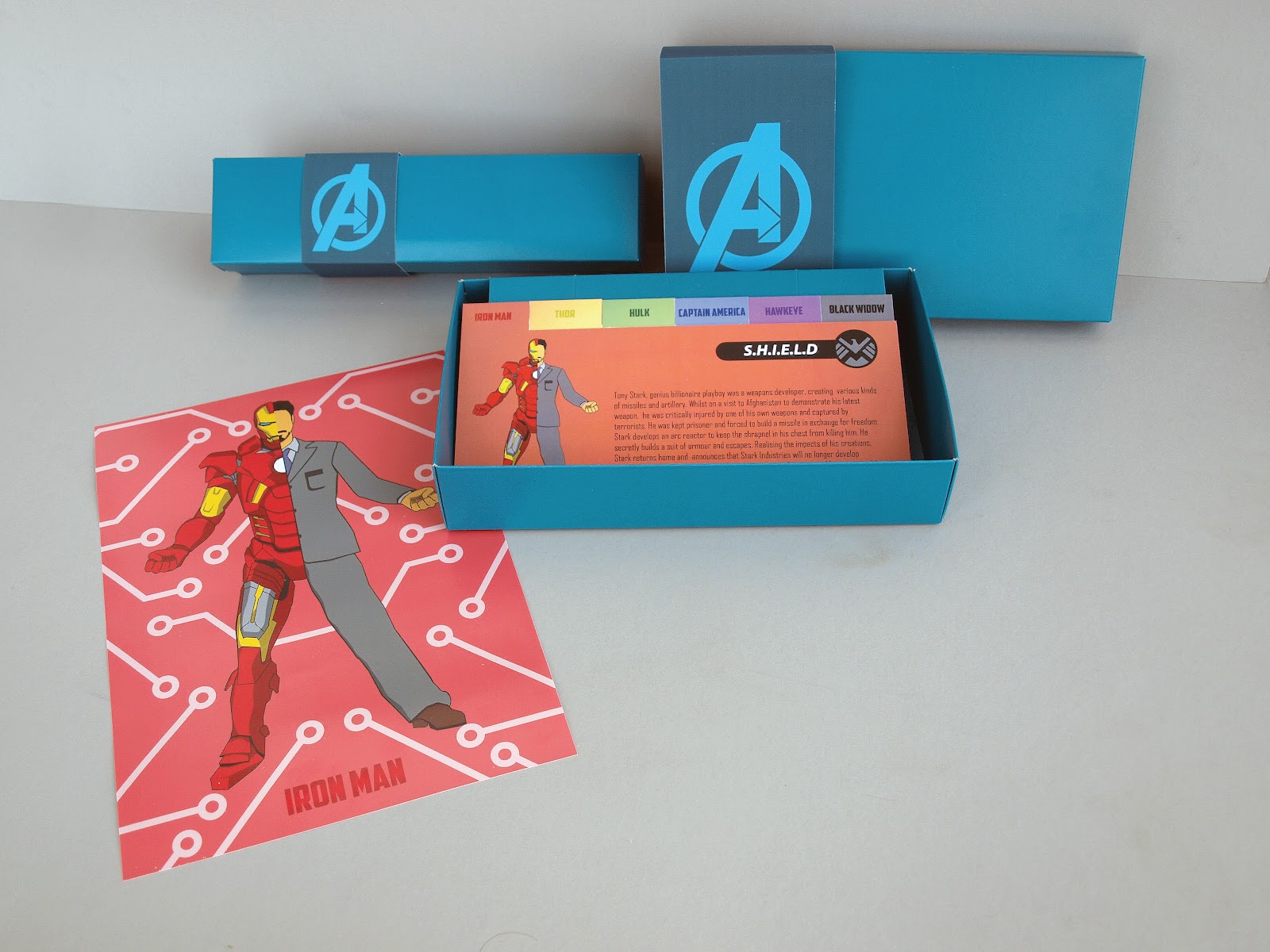
The past fortnight has been quite work heavy. If I'm not sleeping or eating, I'm sitting at my laptop. Still, it needs to be done, even if I have had very little sleep because of it! The posters themselves took far longer than anticipated and I went all the way up to Windsor Photoprints on Tuesday 15th, but they couldn't print them for me! I got them printed today and they are looking pretty well, I am maybe just sick of staring at them for so long. I have also designed some fact cards, which provide some story about each of the characters, for anyone who is maybe not familiar with the characters and their history. I am going to Kaizen to hopefully get these printed tomorrow and once I have those finished, I just need to make the boxes up and the main project is finished.
I have also been partly working on some personal promotion materials,experimenting with logo designs, overall colour and style themes, as well as setting up a profile on the CargoCollective website (still under construction!) Overall, I am happy with how I am doing, despite some things taking a bit longer than anticipated. The rest of the work I need to do is not 'difficult' but rather 'very time consuming.' As soon as I get these fact cards printed, the remaining days will be spent maxing out my folder, getting work in order, finalising personal promotion materials and branding and photographing my work.
I have also been partly working on some personal promotion materials,experimenting with logo designs, overall colour and style themes, as well as setting up a profile on the CargoCollective website (still under construction!) Overall, I am happy with how I am doing, despite some things taking a bit longer than anticipated. The rest of the work I need to do is not 'difficult' but rather 'very time consuming.' As soon as I get these fact cards printed, the remaining days will be spent maxing out my folder, getting work in order, finalising personal promotion materials and branding and photographing my work.
Posters!


Long time no post! I have not neglected this blog, I just wanted to be able to upload my series of posters once they were all finished, to show them as a series. These took significantly longer than anticipated, with Iron Man alone taking an entire week! I finally was able to get them printed onto satin and framed today. I will upload some photographs soon, but still have quite a lot of work to do so updates as soon as possible.
Thursday, 26 April 2012
Iron Man Textures


James Ellison, a classmate who is a wizard with Illustrator was kind enough to give me a short tutorial this morning, showing how to add depth to vectorised images. The top example shown here was made using the methods he taught me. The second example was developed through my own experimentation with the gradient tool. Previously, my Illustrator skills were very basic, but from what I have learned from these experiments, I will be able to add more depth and texture to my upcoming work.
Wednesday, 25 April 2012
A Clockwork Captain


This is a vector image based on David Pelham's famous cover to the novel 'A Clockwork Orange.'
Hawkeye Posters


Here are the first images I created for Jeremy Renner's character Hawkeye. The character is a vector drawing, with a large target symbol drawn into the background. The text is a downloaded font based on The Avengers official logo and is not final.
Iron Man Vectors


Here are my experimentations with Robert Downey Jr's character Iron Man. I did a simple vector outline of the actor's face, then made simple shapes to represent the armour, facial features and hair. The idea was to represent the character without drawing a detailed face, with other elements helping to make the character recognisable. I also did a vector drawing of the character's trademark helmet. I also added metal textured images to help give the image a bit more depth as an experiment.
Captain America Vectors


Here are some of my earliest experiments with vector shapes, showing Chris Evans as Captain America. I have added several effects to each one to experiment with textures and shapes. I have added drop shadows and pointillism to the final two examples.
Project Two

So for my second (and final!) project, I have decided to heavily adapt the little white lies brief. I am going to create a series of posters based on the characters from the upcoming ensemble film 'The Avengers.'
Placement


Here are some examples of the advertisements altered and repositioned for various layouts and formats. This is to show how the campaign is versatile and can be used in a variety of different media. From print, screen and web, the posters can be incorporated easily into different formats for different purposes and markets.
Subscribe to:
Posts (Atom)